Mar 15, 2017
We often talk about how important colour theory is when face painting, but despite nodding wisely I wonder how many of us really understand how to use it effectively. When teaching a typical girly face paint, Bibi and I often advise that students put a cool blue or turquoise on the eyelids, and warm pinks or oranges on the cheeks. All fairly obvious even to little girls, but our face painting students are colour rebels by definition, and seem to love to put blue on the cheeks and pink on the eyelids even after we have explained about warm and cold colours, contrast and tone. We also explain that warm colours 'come forward' and cool colours 'recede', a useful bit of information both for enhancing beauty or shape changing monsters!
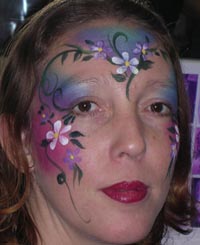
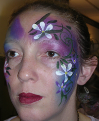
These pictures of two similar make up designs painted on a patient Andrea Child (no relation to Caro) demonstrate the difference that the colour reversal can make, and while an interesting 'moonlight' effect can be achieved by using blue on the cheeks it needs more skill to keep it pretty. One can easily paint bags under the eyes and hollow cheeks by mistake!
This is a design by Rosie Jones, following the same rules of warm cheeks and cool eyes using different complimentary colours. Complimentary colours are opposite each other on the colour wheel (you can now get one one of these at the Facepaint UK shop!).
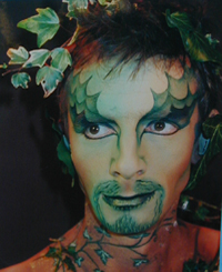 Karen Grace followed the same rules with her stunning Ivy Man but to a different effect.
It is very annoying for us colour rebels that the conventional rules of make-up actually work. But just because blusher can make interesting cheekbones and can widen or lengthen a face does not mean it has to be all the same shade of American tan.
.
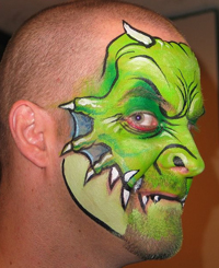 In this example of the Wolfe
Bros work, the masters of shape changing, it is easy to see the strong lines that give the overall shape, but don't miss the deeper, cooler green in
the eye socket and the light highlights on the forehead. Notice also the cool grey blue shading beneath the 'fingers' a useful receding colour that
helps make the 'fingers' stand out. Equally, the pale cool green that fills in the design on the jaw has a tendency to recede.
In this example of the Wolfe
Bros work, the masters of shape changing, it is easy to see the strong lines that give the overall shape, but don't miss the deeper, cooler green in
the eye socket and the light highlights on the forehead. Notice also the cool grey blue shading beneath the 'fingers' a useful receding colour that
helps make the 'fingers' stand out. Equally, the pale cool green that fills in the design on the jaw has a tendency to recede.
.
.
.
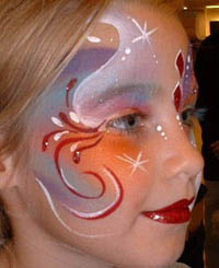
It was an old saying in the FACE Painting Association that if you wanted to win a competition, use orange and black - and it is true that these colours give a very vibrant effect that catches the attention.
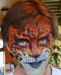
Look at the impact of this Halloween design by Margaret Lincoln, and also the strength of Sophie Reissners' Leopard Man. Being allowed full reign with Orange and Black is one of the reasons that Tigers are so popular with facepainters and their clients. Contrast and impact usually work well, although the strength of the colours can take away the face's natural bone structure, so care must be taken as to where the colour is placed. Both Margaret and Sophie have emphasised the eyes and this keeps the balance of the face. Margaret has used the branches as if they are extreme eye liner, drawing attention to the eyes. Sophie has surrounded the eyes with black to make them stand out against the orange background.
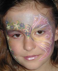
It is quite possible, and popular with parents, to achieve stunning results with pastels and white. Think of Lynne Jamiesons' work and this design by Val Lampkin shows that subtlety can be very beautiful.
One method of deciding on a colour scheme is to choose colours that suit the person and the design you are painting. This can sometimes be the colours they are wearing, sometimes their hair and eye colour will give the clue. Even when you have chosen your colour scheme, placing the colours to enhance the face and keeping the colours in balance with each other for the effect required is so important.
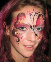 I have worked within a very tight
colour scheme on Lauren in order to emphasise her hair colour; using only colours close to each other on the colour wheel, and relying on black and
white for contrast. I must admit this is a favourite way of working for me.
I have worked within a very tight
colour scheme on Lauren in order to emphasise her hair colour; using only colours close to each other on the colour wheel, and relying on black and
white for contrast. I must admit this is a favourite way of working for me.
.
.
.
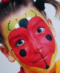
I have been looking through my files to find some examples of what not to do, and although there is plenty of bad face painting, I don't seem to have recorded the colour disasters. This is partly because I only take pictures when I like something, and more often than not even when the brush work is not perfect, it is the overall colour scheme that makes the face. The occasions when it hasn't worked in my opinion are often when I have allowed the client to dictate. This tends not to be a problem with a child's choice, as I am adept at working round their more disastrous ideas, it is the photographers or publishers that want things like a full ladybird face! They go on to publish it, and it becomes an internationally accepted standard design!
This one is redeemed by the models dark eyes in my opinion, otherwise it is just a mask and has no relation to the person within it, the colour choices are complimentary but tonally, red and green are very similar, so there is less impact than with orange and black. In this design the black and white give contrast but there is no subtlety and the model's orange T shirt adds to the confusion, although I have made the green fade into yellow in order to bring a little subtelty to the design.
We go into colour theory in more detail on our 'Colour and Blending Technques' class at The London School of Facepainting.
Thank you to the artists who trustingly have allowed us to feature their work in this article.